11 September 2007, 13:38 UTC#4,471
Mike any progress with the t-shirt design?
11 September 2007, 14:31 UTC#4,472
QUOTE(Skipper @ Sep 11 2007, 03:33 PM)
↑
No offence, I really like it mike...but you seem to be re using everything (from colours to style) over and over lately. Intentional?
Not sure what you're referring to. Examples plz?
I'm come across a block recently with graphic work, hopefully starting uni will help me get back into it.
And nope Jones, as I don't have money to print shirts even if I did finish it. Doubt new DR shirts will be around for a long while.
11 September 2007, 14:44 UTC#4,473
Like you seem to use alot of blue, alot of the whole explosion type line things, I swear iv'e seen tht font used by you on that album cover before in a DR piece? and the all balls site looks alot like your own.
Just an observation.
11 September 2007, 14:52 UTC#4,474
Just what the client asks for. Yates came up with the All Balls design himself and just wanted me to make it. And ATRF wanted the cover blue.
And nope, never used that font cause it's cheesy as hell.
11 September 2007, 14:55 UTC#4,475
Well yates ripped you off, I think you should fight him...you could probbaly take him.
11 September 2007, 15:34 UTC#4,476
COOLVETICA
11 September 2007, 19:18 UTC#4,477
QUOTE(RyanH @ Sep 11 2007, 02:59 AM)
↑11 September 2007, 20:15 UTC#4,478
looks alot like the obey design
11 September 2007, 20:35 UTC#4,479
QUOTE(BFD77 @ Sep 11 2007, 05:15 PM)
↑
looks alot like the obey design
yer right
its that propaganda shit!
Image file not present in the recovered backup14 September 2007, 03:53 UTC#4,480
I want to see more .Good links !Thank you!
14 September 2007, 21:33 UTC#4,481
14 September 2007, 22:18 UTC#4,482
man if that gets to be on print ima totally buy one!!
14 September 2007, 22:32 UTC#4,483
Needs something to change the focus a bit because it's starting to look a lil bit jumbled. I still enjoy it.
14 September 2007, 23:26 UTC#4,484
in-fucking-sane...love it
15 September 2007, 05:03 UTC#4,485
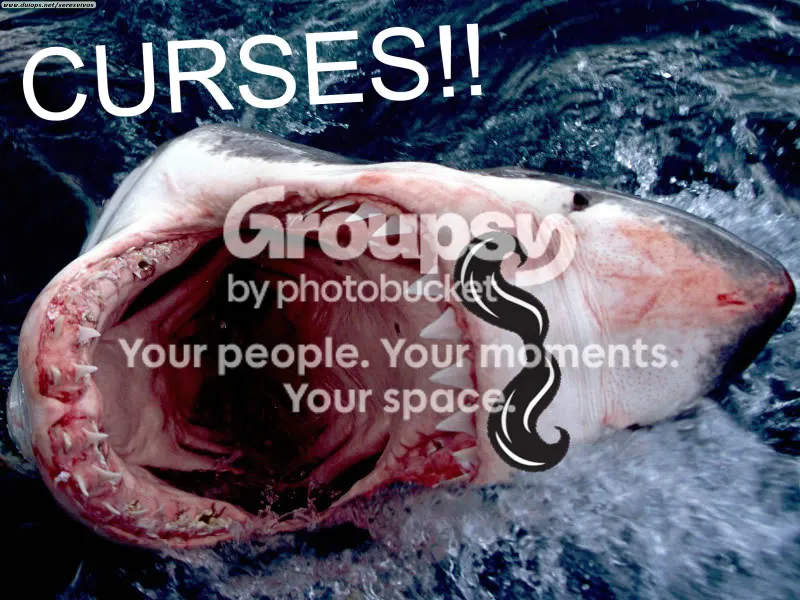
my latest masterpice
15 September 2007, 05:53 UTC#4,486
hahahahahahahaha!
15 September 2007, 16:35 UTC#4,487
that would suck falling inside there
15 September 2007, 18:30 UTC#4,488
QUOTE(John @ Sep 14 2007, 11:33 PM)
↑sick
Image file not present in the recovered backup15 September 2007, 20:21 UTC#4,489
A lot of flashy color in your art I love it
16 September 2007, 16:54 UTC#4,490
ta guys

16 September 2007, 17:38 UTC#4,491
QUOTE(Sla-Vin @ Sep 15 2007, 05:35 PM)
↑
that would suck falling inside there
fuckin right!
17 September 2007, 15:39 UTC#4,492
QUOTE(MattG @ Sep 16 2007, 09:38 PM)
↑QUOTE(Sla-Vin @ Sep 15 2007, 05:35 PM)
↑
that would suck falling inside there
fuckin right!
No it wouldn't. That picture is fake. Take a look above the shark's mouth and you can see a mustache. Ok, and since when did harks have mustaches..?
Thought so.
17 September 2007, 18:14 UTC#4,493
its a shark in disguise...but I caught on
18 September 2007, 22:49 UTC#4,494
19 September 2007, 00:05 UTC#4,495
Add an apostrophe to the word "whats" and it's perfect. Nothing kills a good message like poor grammar. Just makes whomever is bitching about something look dumb.
19 September 2007, 05:35 UTC#4,496
QUOTE(Ray @ Sep 18 2007, 09:05 PM)
↑
Add an apostrophe to the word "whats" and it's perfect. Nothing kills a good message like poor grammar. Just makes whomever is bitching about something look dumb.
knew something was missin
thanks for pointing out!
External image not preserved — inspect source: http://i69.photobucket.com/albums/i48/Sabotageonline/lovepark11.jpg19 September 2007, 07:50 UTC#4,497
lol.
19 September 2007, 17:02 UTC#4,498
Did DC ever get their LOVE park cause through?
19 September 2007, 18:50 UTC#4,499
QUOTE(benCKa @ Sep 19 2007, 02:02 PM)
↑
Did DC ever get their LOVE park cause through?
hell no
freeing love park isnt really gonna work, even if it were bribory
just not happening till the new mayor possably frees it..
21 September 2007, 18:59 UTC#4,500



