15 March 2006, 17:26 UTC#2,701
heres a bg I made, came out pretty cool
External image not preserved — inspect source: http://i10.photobucket.com/albums/a105/magotmike44/skullbg.jpgwatta u guys think any cc?
QUOTE(MyK @ Mar 15 2006, 05:22 PM)
↑ahit why I don't know why it came out so small
15 March 2006, 17:26 UTC#2,702
I like it Myk.
Thanks for sig Tomm, DOES NEED A BORDER THOUGH.
Nice site as well Mono, I like the colours, but its a little boring design. Sowwie. I can give you some tips if you want man.
Zaid your stuff is getting alot better keep it up.
And I like your piece Joe.

15 March 2006, 17:28 UTC#2,703
QUOTE
Thanks for sig Tomm, DOES NEED A BORDER THOUGH.
Tough, add it yourself noob

15 March 2006, 17:29 UTC#2,704
With paint? Image file not present in the recovered backup
15 March 2006, 17:30 UTC#2,705
QUOTE(made @ Mar 15 2006, 05:26 PM)
↑I like it Myk.
Thanks for sig Tomm, DOES NEED A BORDER THOUGH.
Nice site as well Mono, I like the colours, but its a little boring design. Sowwie. I can give you some tips if you want man.
Zaid your stuff is getting alot better keep it up.
And I like your piece Joe.
hahaha keeping everyone happy
thankx man
15 March 2006, 18:25 UTC#2,706
QUOTE(made @ Mar 15 2006, 05:26 PM)
↑
Nice site as well Mono, I like the colours, but its a little boring design. Sowwie. I can give you some tips if you want man.
Yes plz.
As I said ts not finished so yeah its needs work

15 March 2006, 22:18 UTC#2,707
QUOTE(made @ Mar 15 2006, 06:26 PM)
↑
Zaid your stuff is getting alot better keep it up.
Thanks alot man
15 March 2006, 22:31 UTC#2,708
QUOTE(exoh @ Mar 14 2006, 11:40 AM)
↑A shot at my portfolio site or whatever. Any suggestions? I know something is missing.
I wanna keep it simple, so don't tell me its boring.
External image not preserved — inspect source: http://img136.imageshack.us/img136/8624/exoh3mj.jpgo come on , you can do way better
15 March 2006, 22:55 UTC#2,709
I like it. I liked the colour sceme at first but then I didn't but then I did but then I didn't again.
edit - I love it again!
16 March 2006, 03:55 UTC#2,710
QUOTE(Karl @ Mar 15 2006, 05:31 PM)
↑QUOTE(exoh @ Mar 14 2006, 11:40 AM)
↑A shot at my portfolio site or whatever. Any suggestions? I know something is missing.
I wanna keep it simple, so don't tell me its boring.
External image not preserved — inspect source: http://img136.imageshack.us/img136/8624/exoh3mj.jpgo come on , you can do way better
I like it but I thought exoh was just a cover up until everything calmed down.
Mono is better bro.
16 March 2006, 05:58 UTC#2,711
Made a sig....yay for me

16 March 2006, 07:36 UTC#2,712
Just as gay as you...
16 March 2006, 07:39 UTC#2,713
QUOTE(xpose @ Mar 14 2006, 09:25 PM)
↑ It has potential, some tips for making it look better
:
Move the 'exoh' text and sub text left and make it in line with the left side of the content box.
Change the nav font, its nasty, have something more clean.
The outerglow is a touch too heavy, as are the stripes in the top right, maybe just take them out?
Also I'd play around with some colour schemes too
Thanks man for the advice, I'll play around with it all. I think it needs a real light pattern somewhere to make it stand out more.
QUOTE(Karl @ Mar 15 2006, 10:31 PM)
↑
o come on , you can do way better
External image not preserved — inspect source: http://karlb.com/vector1final2.gifQUOTE(T0M @ Mar 16 2006, 03:55 AM)
↑
I like it but I thought exoh was just a cover up until everything calmed down.
Mono is better bro.
Mono is always my alias. I just decided against it for my site.
Partly because a lot of mono domains are taken (I can get exoh.co.uk) and also because Mono Design is already a company.
I just prefered it as a site name.
16 March 2006, 08:40 UTC#2,714
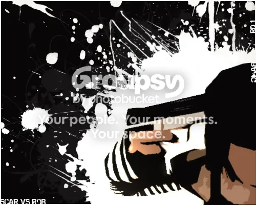
quick battle piece...nothing special....
16 March 2006, 09:06 UTC#2,715
Yick hate the cheesy filter man.
16 March 2006, 09:10 UTC#2,716
cant help it...I cant do vectors yet...well I can, but they look like karls...
16 March 2006, 09:35 UTC#2,717
QUOTE(r0b @ Mar 16 2006, 08:40 AM)
↑quick battle piece...nothing special....
NOICE!

16 March 2006, 09:37 UTC#2,718
QUOTE(wkh @ Mar 16 2006, 04:35 AM)
↑QUOTE(r0b @ Mar 16 2006, 08:40 AM)
↑quick battle piece...nothing special....
NOICE!
<9
16 March 2006, 17:00 UTC#2,719
Not bad Rob. Think you can do better though.
16 March 2006, 17:04 UTC#2,720
QUOTE(r0b @ Mar 16 2006, 08:40 AM)
↑quick battle piece...nothing special....
Hmmmm, a few splat brushes and a picture with a filter on it, could be done in literally less than a minute...
16 March 2006, 20:11 UTC#2,721
QUOTE(xpose @ Mar 16 2006, 12:04 PM)
↑QUOTE(r0b @ Mar 16 2006, 08:40 AM)
↑quick battle piece...nothing special....
Hmmmm, a few splat brushes and a picture with a filter on it, could be done in literally less than a minute...
yeah, but in the end...im still vip and noe one trusts you...
Image file not present in the recovered backup(notice: I said quick)
16 March 2006, 20:15 UTC#2,722
QUOTE(r0b @ Mar 16 2006, 08:40 AM)
↑quick battle piece...nothing special....
Nice man, I like it, but it is really cliche with the whole gun to the head thing, but still the skill is good.
Nice work.
16 March 2006, 20:15 UTC#2,723
No offence Rob but that was lame comeback
Xpose has a point though, sorry dude. You should take pride in your work, try to advance - stop using tacky filters, over-used brushes and nasty fonts.
16 March 2006, 20:19 UTC#2,724
QUOTE(Mono @ Mar 16 2006, 03:15 PM)
↑No offence Rob but that was lame comeback
Xpose has a point though, sorry dude. You should take pride in your work, try to advance - stop using tacky filters, over-used brushes and nasty fonts.
I enjoyed making it...k?
16 March 2006, 20:28 UTC#2,725
I'm not getting at you man, I'm just offering constructive criticism because I notice the same little things in your pieces. Just try to work on them.
edit: k, you editied your post.
16 March 2006, 20:34 UTC#2,726
Im not in the mood to start any arguements...so I edited my post...I know you are trying to help...you always give great comments and give it to me how it is...
17 March 2006, 00:11 UTC#2,727
I say just stay away from filters completely. Too tacky and everyones seen them used too much before.
Still, nice work robske
17 March 2006, 00:14 UTC#2,728
QUOTE(Adrian Rize @ Mar 17 2006, 12:11 AM)
↑
I say just stay away from filters completely. Too tacky and everyones seen them used too much before.
Still, nice work robske
Not all filters, what about blur/sharpen etc?
17 March 2006, 01:16 UTC#2,729
QUOTE(Tomm @ Mar 17 2006, 12:14 AM)
↑QUOTE(Adrian Rize @ Mar 17 2006, 12:11 AM)
↑
I say just stay away from filters completely. Too tacky and everyones seen them used too much before.
Still, nice work robske
Not all filters, what about blur/sharpen etc?
yeah obviously, you no what im talking about.
Image file not present in the recovered backup 17 March 2006, 03:26 UTC#2,730
QUOTE(Adrian Rize @ Mar 16 2006, 07:11 PM)
↑
I say just stay away from filters completely. Too tacky and everyones seen them used too much before.
Still, nice work robske
<3...couldnt avoid it...I dont know vectors and the pic stood out to much plain...even when I played with the lighting...
thx for the suggestions



