11 October 2008, 15:17 UTC#5,011
11 October 2008, 15:20 UTC#5,012
Fail.
11 October 2008, 17:48 UTC#5,013
11 October 2008, 17:50 UTC#5,014
QUOTE(wkh @ Oct 11 2008, 05:48 PM)
↑haha love it
11 October 2008, 17:59 UTC#5,015
QUOTE(wkh @ Oct 11 2008, 07:48 PM)
↑Im loving it.
12 October 2008, 00:59 UTC#5,016
I've been wanting to make a blog site for some time now. Tooooom, make me one haha.
12 October 2008, 16:59 UTC#5,017
I've just finished the work on a basic design for a company but they wont let me change the logo, and I think it lets the whole site down.
http://www.atommultimedia.com/thomas/default.htm I've added the drop shadow the the logo, as before then it looked like a ms paint job!
12 October 2008, 17:06 UTC#5,018
12 October 2008, 17:10 UTC#5,019
It still looks gay. It sticks out well bad.
12 October 2008, 17:11 UTC#5,020
QUOTE(mono @ Oct 12 2008, 06:06 PM)
↑I sent over some new logos, but they have already gone to printing so its to late to change
Image file not present in the recovered backup12 October 2008, 17:11 UTC#5,021
Just vectorize it?
12 October 2008, 17:16 UTC#5,022
QUOTE(mono @ Oct 12 2008, 06:11 PM)
↑
Just vectorize it?
I think I will have to, but Im just waiting on a ok from them before I do anymore work on it.
12 October 2008, 17:18 UTC#5,023
It looks mspainted
13 October 2008, 10:57 UTC#5,024
QUOTE(wkh @ Oct 12 2008, 05:11 PM)
↑QUOTE(mono @ Oct 12 2008, 06:06 PM)
↑I sent over some new logos, but they have already gone to printing so its to late to change
Image file not present in the recovered backupMan that sucks, I hate it when you design something for someone and they tell you to use their logo which is a complete load of wank and you cant change it

13 October 2008, 20:41 UTC#5,025
16 October 2008, 22:35 UTC#5,026
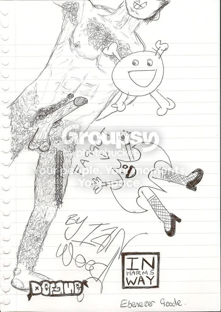
By "Ian Wood"
16 October 2008, 22:54 UTC#5,027
lol awsome.
17 October 2008, 08:02 UTC#5,028
Thats how boring our lectures are.
25 October 2008, 00:25 UTC#5,029
25 October 2008, 00:45 UTC#5,030
Looks sick dude.
25 October 2008, 04:21 UTC#5,031
Shouldn't it be "Joe's"?
Looks good though.
25 October 2008, 09:12 UTC#5,032
Reminds me of audiosurf haha. Looks well nice though.
MOAR GLOSS.
25 October 2008, 09:14 UTC#5,033
QUOTE(Mr. Brown @ Oct 25 2008, 05:21 AM)
↑
Shouldn't it be "Joe's"?
Looks good though.
Yeah it should and it irritates me too, but that's the way the band want it.
Image file not present in the recovered backup Thanks gaiz.
25 October 2008, 09:46 UTC#5,034
QUOTE(k. @ Sep 29 2008, 03:02 PM)
↑
toy.
You gangsta kane, you.
25 October 2008, 15:10 UTC#5,035
Hawt Mike.
04 November 2008, 01:56 UTC#5,036
04 November 2008, 02:58 UTC#5,037
thats fucking unreal!
theres one bit im not liking to much, the star, but its like nothing compared to how much I love that pic man!
04 November 2008, 03:11 UTC#5,038
thanks man, I like the star. it gives it that.. not perfect feeling. it's just hanging from the string, giving it that fake world you want to grasp, kinda thing.
04 November 2008, 04:24 UTC#5,039
fair enough.. end of the day as long as u like it its alllll good

04 November 2008, 04:52 UTC#5,040
mmhm def.