09 December 2006, 20:06 UTC#4,021
no work.
12 December 2006, 03:01 UTC#4,022
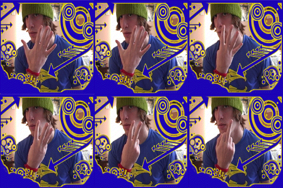
1st thing I did in flash
12 December 2006, 04:22 UTC#4,023
Poor you.
12 December 2006, 04:28 UTC#4,024
You're so ugly Cullen. But, nice job with the flash, maybe you should keep trying.
12 December 2006, 14:21 UTC#4,025
12 December 2006, 14:24 UTC#4,026
QUOTE(benCKa @ Dec 12 2006, 05:21 PM)
↑Really like the design, forgot to say that in the thread
14 December 2006, 19:13 UTC#4,027
Shocker's mom is a marketing director at a somewhat large cable company and she needed a logo so I banged one out...isnt much...especially for being the 2nd time I have touched photoshop in the last 6 months or so...

14 December 2006, 21:11 UTC#4,028
I finally took time to create a big ass piece again, it's about smoking obviously, took me some hours:
http://www.kuffi.net/dodelijk.jpgpretty big so

15 December 2006, 09:52 UTC#4,029
Hate doing print work but here's some rough designs (text) is a bit hard to read on some bits but effort to change it;
http://www.cloud-one.com/clients/deepbluepodcasts/designs/Full res
http://www.cloud-one.com/clients/deepbluep.../designs/large/15 December 2006, 13:08 UTC#4,030
neka, there's a few bugs in this one:
http://www.cloud-one.com/clients/deepbluep...blue_wip_03.pngbut im sure you've noticed that yourself already.. did u do it in Illustrator? Nice stuff nevertheless. And kinda stupid but if you'd turn upside down it reminds me of my one eyed snake... Just a bit.
15 December 2006, 13:37 UTC#4,031
QUOTE(neKa @ Dec 15 2006, 12:52 PM)
↑Hate doing print work but here's some rough designs (text) is a bit hard to read on some bits but effort to change it;
http://www.cloud-one.com/clients/deepbluepodcasts/designs/Full res
http://www.cloud-one.com/clients/deepbluep.../designs/large/Really really nice! well made! tho. I dont like the logo...
15 December 2006, 14:41 UTC#4,032
SOMEONE CHECK MINE!

15 December 2006, 14:53 UTC#4,033
penis

sorry
15 December 2006, 16:33 UTC#4,034
Pretty cool Kevin. Whats the text say?
Also, Kane the logo you made is more or less identical to mine haha.
15 December 2006, 19:29 UTC#4,035
QUOTE(kuffi @ Dec 15 2006, 02:08 PM)
↑neka, there's a few bugs in this one:
http://www.cloud-one.com/clients/deepbluep...blue_wip_03.pngbut im sure you've noticed that yourself already.. did u do it in Illustrator? Nice stuff nevertheless. And kinda stupid but if you'd turn upside down it reminds me of my one eyed snake... Just a bit.
What bugs are there? Yeah I did it in illustrator. First thing my client said when he saw that logo was 'Don't you think that kinda looks like a cock?' haha, it was inevitable.
QUOTE(made @ Dec 15 2006, 05:33 PM)
↑
Pretty cool Kevin. Whats the text say?
Also, Kane the logo you made is more or less identical to mine haha.
Haha yeah there isn't much you can do with it really.
15 December 2006, 23:41 UTC#4,036
QUOTE(made @ Dec 15 2006, 06:33 PM)
↑
Pretty cool Kevin. Whats the text say?
Also, Kane the logo you made is more or less identical to mine haha.
It says "deadly".. just some anti-smoking poster.. for the hell of it. Haha u dont wanna see the original pic. Darn.
16 December 2006, 09:51 UTC#4,037
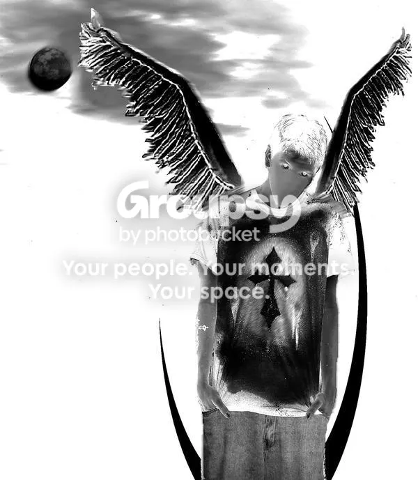
a friend of mines pic hes new but not bad
16 December 2006, 10:31 UTC#4,038
QUOTE(e4rthbound_flynn @ Dec 16 2006, 10:51 AM)
↑a friend of mines pic hes new but not bad
I beg to differ.
16 December 2006, 11:16 UTC#4,039
16 December 2006, 11:23 UTC#4,040
thats not a cannon......
( I love you joe )
16 December 2006, 11:26 UTC#4,041
QUOTE(iammarcmason @ Dec 16 2006, 12:23 PM)
↑
thats not a cannon......
( I love you joe )
Lol......Well....it's a new kind of cannon....a gun shaped one.
16 December 2006, 11:38 UTC#4,042
well either way it looks good

16 December 2006, 12:11 UTC#4,043
I like it, I think the typography could be improved though.
16 December 2006, 12:18 UTC#4,044
QUOTE(neKa @ Dec 16 2006, 01:11 PM)
↑
I like it, I think the typography could be improved though.
Cheers, yer I know nothing of typography, I mucked around with lots of fonts, that one seemed to fit the best. Any ideas on improvments?
16 December 2006, 12:48 UTC#4,045
QUOTE(Opinionated Joe @ Dec 16 2006, 01:18 PM)
↑QUOTE(neKa @ Dec 16 2006, 01:11 PM)
↑
I like it, I think the typography could be improved though.
Cheers, yer I know nothing of typography, I mucked around with lots of fonts, that one seemed to fit the best. Any ideas on improvments?
I'm pretty new to it too, just play around with it a bit I guess. The font fits quite well, it's just the placement that doesn't seem right.
16 December 2006, 15:10 UTC#4,046
QUOTE(neKa @ Dec 16 2006, 01:11 PM)
↑
I like it, I think the typography could be improved though.
Image file not present in the recovered backup16 December 2006, 20:14 UTC#4,047
16 December 2006, 20:18 UTC#4,048
Love the idea, hate the font. This might seem wierd, but the whole thing seems almost blurry, I dunno, like it's not that sharp and clear. The face is gay posterised at the top. The concept, like I said, is good and I like the colour scheme.
16 December 2006, 20:19 UTC#4,049
couldnt be bothered to vector it.
16 December 2006, 21:20 UTC#4,050



