Forum index / General Homegrown / Rejected Site Updated!

Rejected Site Updated!

5 posts · page 1 of 1

post #2
28 May 2009, 08:11 UTC#2
Mix up the font a bit.

The one that says 'coming this fall' looks gash.
post #3
28 May 2009, 12:59 UTC#3
Kinda lame that you linked to stileproject just under "porno." I was expecting fan pics with tits, not a plug for a site like that.

I like the design. It's really basic and clean. It serves your purpose really well. I know that I was able to quickly and easily view your popular videos just by surfing through the homepage. I wouldn't change much. Tom's right about the "coming this fall" font, though. It doesn't really go too well with everything else.

p.s. -

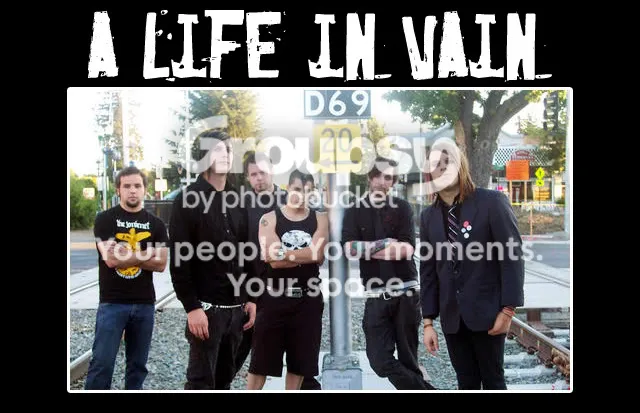
IPB Image

I would do my best to disassociate myself with these guys at all cost.

edit - for obvious reasons.
post #4
28 May 2009, 22:55 UTC#4
But they get free music for that, and its not the first band displayed. I actually dig the picture of the first band.

edit: just relooked the pic, it might not be worth of the free music :biggrin:

2ndedit: specially those guys music.
post #5
29 May 2009, 04:16 UTC#5
I dig man

sabotageonline.com has an improvement too